")
")


 – 2024 Hindi")
And so, every month, we put together this roundup of the best new fonts we’ve found online in the previous four weeks. Enjoy!
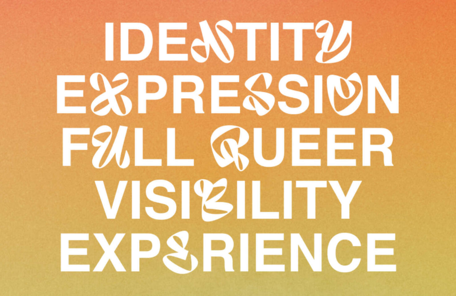
Audaz
Audaz is a custom font designed for Nike’s “No Pride, No Sport” campaign. It was created letter-by-letter, looking for new ways to express old shapes. Each glyph is intended to have its own unique identity while remaining faithful to the letters in the Latin alphabet.
Korium
Korium is a new variable font with extremely condensed forms and a Humanist influence. The letters are designed to feel soft and inviting on the outside and sharp and spikey on the inside. It’s an excellent choice for designers needing a contemporary sans with some edginess.
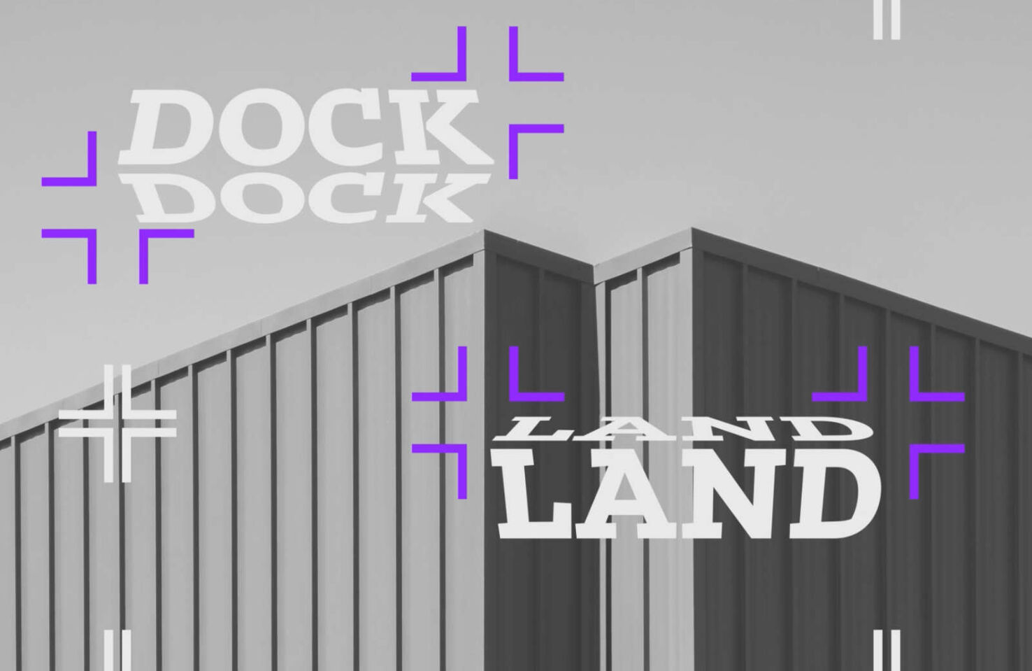
Dockland
Dockland is a slab-serif typeface with angular shapes and a robust and confident aesthetic. The typeface was designed drawing inspiration from blackletter elements and lithographic prints from the 1890s. The modern proportions and multiple weights make it great for branding projects.
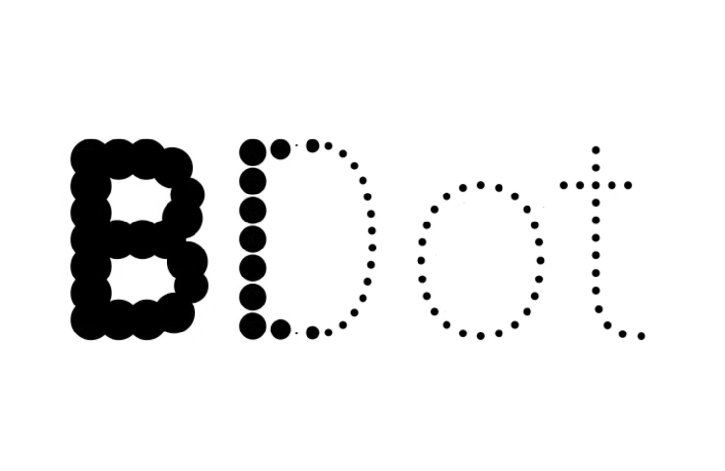
BDot
Who doesn’t love a dot-based font? BDot is a typeface with multiple thicknesses of dots that animate fantastically. It’s most legible in lighter weights at large sizes, and it shares its skeleton with the companion typeface BLine, so they partner perfectly.
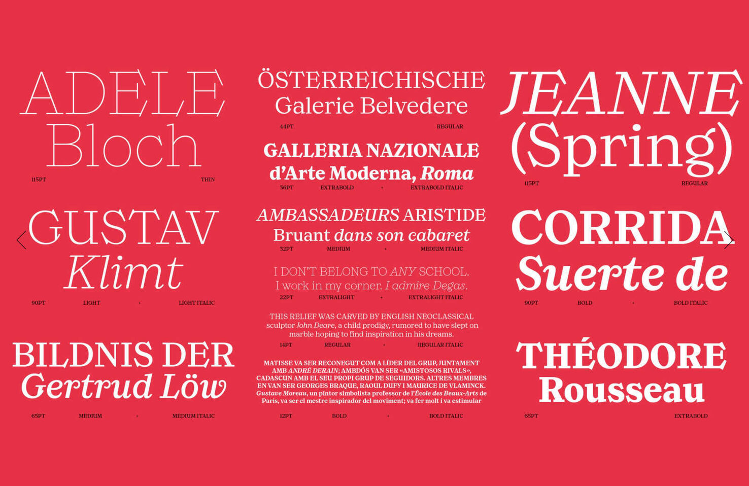
Moisette
Moisette is a beautiful typeface designed at the juxtaposition of classic and modern designs. Thanks to its high-contrast stem ratio and generous x‑height, it’s very legible. It’s ideal for editorial work when you need something elegant and high-quality.
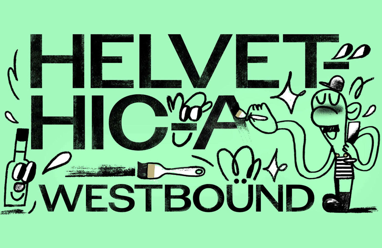
Avgarde
Avgarde is a tongue-in-cheek tribute to large-scale, hand-lettered, Helvetica-style type; specifically, the large-scale, hand-lettered, Helvetica-style type on the side of a rail station in Boston. It’s intended as an antidote to the seriousness of the International style.
Britney
Britney is a challenging typeface designed as an experiment with the possibilities of variable font technology. It comes in one legible uppercase set and two eccentric lowercase styles. You can mix and match these styles to create unique designs.

Raptor Text
If you’ve watched Jurassic Park, you’ll know that Raptors are small but fast. Raptor Text is the same: ideal for smaller font sizes while still being fast to read. It takes a conservative approach to styling, preserving some of the features that most people tend to prefer.
Laica
Laica blends the styles of broad and pointed nib pens resulting in a typeface that feels hand-drawn, despite the classic forms. This human quality snubs the loftiness of the formal alphabet to create a font family that feels grounded and honest.

Ernst
Ernst is a stylish slab serif that is very capable when used for body text but has enough details to be interesting at display sizes. Its italic is inspired by the lettering found in and around Parisian movie theatres from the 1920s-1940s.
Aubusson
Aubusson is a beautiful typeface inspired by the tapestries of France’s “Cité Internationale de la tapisserie d’Aubusson.” The design references the grid-like patterns in the cloth, and the warmth of the letterforms recalls the craft of weavers.

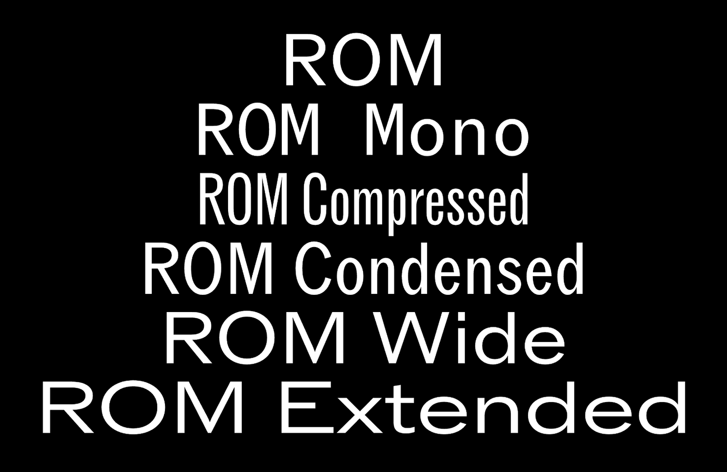
Rom
Rom is a workhorse of a sans-serif, with various widths and a mono version available. It mixes Grotesk and Gothic styles with predictable letterforms but plenty of detail to create a family that works well for corporate branding, advertising, and logo design.
Hooey
If you’re looking for fun, Y2K-inspired hand-lettering, look no further! Hooey is a blobby font, only to be used for display purposes, that would be right at home on a school locker or maybe a band poster.
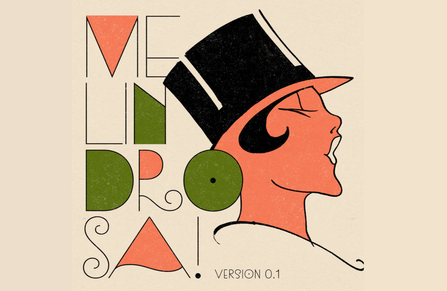
Melindrosa
Melindrosa is a unique display face inspired by the lettering of Brazillian artist J. Carlos, whose Aert Deco-inspired work was featured in numerous publications from the 1920s-1940s.
Basel
Basel is a versatile font family with four styles: Grotesk, Grotesk Mono, Classic, and Classic Mono. The latter two styles offer increased stroke contrast. Each style has a variable font version allowing you to use the full range of weights online without blowing your size budget.
Ben Moss
Ben Moss is Senior Editor at WebdesignerDepot. He’s designed and coded work for award-winning startups, and global names including IBM, UBS, and the FBI. One of these days he’ll run a sub-4hr marathon. Say hi on Twitter.