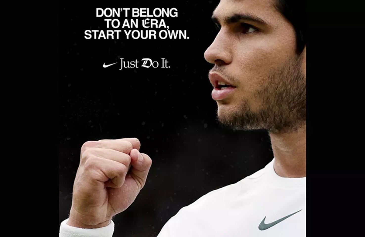
Nike’s ‘Just Do it’ slogan has long been one of the world’s most recognizable taglines. Even those who have never purchased a piece of Nike apparel can immediately identify the sports brand’s iconic slogan. It’s simple, memorable, and timeless — the perfect trifecta of all great typography. Most would argue it doesn’t need changing, which is why many designers are confused as to why Nike has altered the tagline’s typography in their most recent promotion.
Perplexed designers have been jumping to social media to ask why Nike’s new promotion features two unusual gothic-styled letters at the start of ‘era’ and ‘do’. Many revealed they didn’t actually believe it was a Nike promotion at first, instead assuming it was a fan’s proposal.
Nike usually allows the words of their slogan to do the talking. The font is typically minimalist with no additional changes. Now Nike seems keen to mix things up. Why, you ask? We don’t know. The old-fashioned ‘E’ presumably draws attention to the connotations of the word ‘era’, but this still doesn’t explain the gothic typeface in ‘do’.
The only plausible solution to Nike’s unusual decision is that they are jumping on the Gen‑Z trend of mixing typographical styles. This makes sense, as Nike has long attempted to be at the forefront of youth culture. That said, given the success of Nike’s minimalist branding over the last three decades, this new change of direction feels out of place. If it isn’t broken, don’t fix it.
Robert Reeve
Robert is an experienced marketing professional with extensive experience working with brands to refine go-to-market plans, SEO campaigns, and content marketing strategies. A committed writer with a keen eye on the latest developments, Robert specialises in producing content across all things tech and marketing.


