

")
")

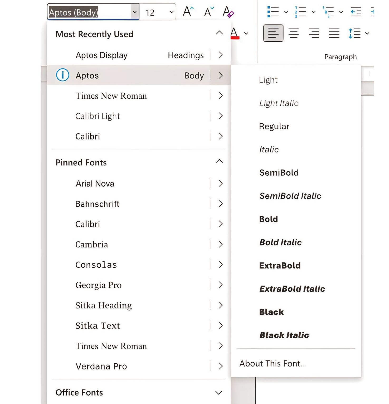
We recently released an article on Aptos, Microsoft’s upcoming default font for Office. The typeface is set to replace Calibri, which has served as Microsoft’s official font for more than 16 years.
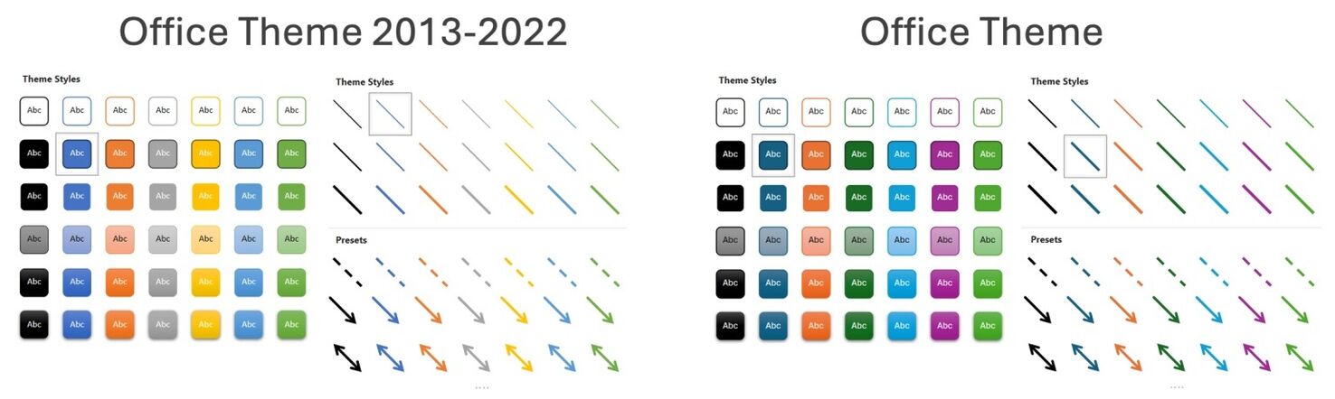
Now, Microsoft has announced its intention to bundle the release of Aptos with a new look theme for Office. The default font will debut alongside other alterations, such as changes to the color palettes, line weights, and style of documents.
The most significant difference between the old (left) and new theme (right) is that the default colors are now darker and more muted. The yellow color has been relegated in favor of dark green, likely because yellow shapes are notoriously challenging to see against a white background.
Overall, it seems that Microsoft is attempting to make their service feel more professional. The previous colors felt playful and (if we’re honest) a little bit cheap. In contrast, the new palette feels more modern, sharp, and slick — better suited to the world’s leading word processing program.
Microsoft initially rolled out the changes exclusively to Microsoft 365 Insiders earlier this year. The company now says they intend to release the changes to the public sometime in September.
Shelley Cooke
Shelley Cooke is a blogger and podcaster from Asheville, North Carolina (Go Oilers!). She’s passionate about technology and the role it plays in building communities.