


 | Tusshar Kapoor | Naseeruddin Shah | Rahul Dev | 9th December")
Today, you will learn how to create a rollercoaster path that a ball follows using cubic beziers and CSS transitions. You’ll also learn how the
cubic-bezier function in CSS works in detail and how to stack multiple simple animations to create one complex one.
Note: This article assumes that you have basic knowledge of CSS animations. If you don’t, please check out this guide by Tom Waterhouse before proceeding with this article.
Creating advanced CSS animations is great for UX and design purposes. You can make an interactive website that pleases the visitor and makes them remember your website. Animations sounds like a hard topic but once you understand them you will be able to create amazing websites like this one! Yes, this is only created with CSS!
First, let’s dive into the magic and power of the cubic-bezier function.
cubic-bezier: What Is It And How Can We Use It?
The cubic-bezier function in CSS is an easing function that gives you complete control of how your animation behaves with respect to time. Here is the official definition:
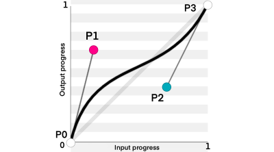
“A cubic Bézier easing function is a type of easing function defined by four real numbers that specify the two control points, P1 and P2, of a cubic Bézier curve whose end points P0 and P3 are fixed at (0, 0) and (1, 1) respectively. The x coordinates of P1 and P2 are restricted to the range [0, 1].”
— CSS Easing Functions Level 1
W3C Candidate Recommendation Draft, 1 April 2021
If you want to learn more about easing functions, you can check out this article by Adrian Bece. It goes behind the scenes of how linear, cubic-bezier and staircase functions work.
The x-axis (time) is restricted between [0,1]. However, the y-axis (output) isn’t limited to a certain range.
Our goal for the cubic-bezier is to create the sliding parabola at the beginning of the required animation. But in order to get there, we’ll start small and learn how to create a parabolic curve using cubic-bezier.
The Parabolic Curve
From the definition of the parabolic curve, you may notice that making a perfect parabolic curve seems impossible because P0 must be at (0, 0) and P3 must be at (1, 1) while parabolic curves start and end at the same horizontal axis, so we’ll need P3 to be at (1, 0).

It’s true that we can’t make a perfect parabola. However, we can create something close to it.
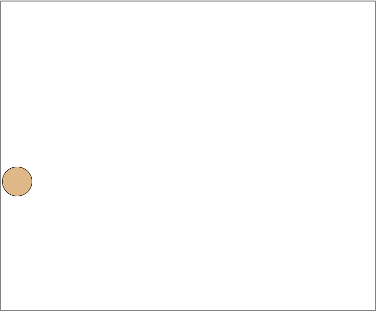
Creating The Ball
We need to create an object that we will model for our animation, I chose a ball because it is simple, but of course you are free to use whatever object you want.
Add the following code to your HTML and CSS files:
<div class="ball"></div>
.ball {
  background-color: burlywood;
  height: 50px;
  width: 50px;
  border: 1px solid black;
  border-radius: 50px;
  position: fixed;
  left: 10px;
  top: 300px;
}
You should get something like this:
Moving The Ball Along The X-Axis
We want to create two animations, one across the x-axis and one across the y-axis. The x-axis animation is a linear animation that moves the ball from one point to the other.
- Add a keyframes, we’ll call it x:
@keyframes x {
  to {
    left: 500px;
  }
}
- Add the keyframe to the animation attribute in the ball class:
.ball {
  background-color: burlywood;
  height: 50px;
  width: 50px;
  border: 1px solid black;
  border-radius: 50px;
  position: fixed;
  left: 10px;
  top: 300px;
  animation: x 2s linear forwards;
}
Now the ball is moving along the x axis!
See the Pen [x-axis animation](https://codepen.io/smashingmag/pen/qBxawvO) by Yosra Emad.
Moving The Ball Along The Y-Axis
For the animation along the y-axis, we want the ball to go along a curve. The last point on the y axis is the same as the initial point. However, in order for the animation to run, we will need to make a small difference in the y-axis. So, in our case, we’ll change the top attribute of the ball class from 300 to 299.5.
Notice how we decreased the value of the top attribute; this will make our animation move in the normal direction (bottom →top →bottom). If we instead increased the value of the top attribute to 300.5, it would play the animation in the opposite direction:
@keyframes y {
  to {
    top: 299.5px;
  }
}
- Add the new keyframes to the same animation in the ball class
animation: x 2s linear forwards, y 2s cubic-bezier(0, 500, 1, 500) forwards;
This will be the resulting animation:
See the Pen [y-axis animation](https://codepen.io/smashingmag/pen/mdXRzRW) by Yosra Emad.
But why did we choose these certain cubic-bezier function values? let’s find out!
🚨 WARNING: Maths ahead! 🚨
The Maths Behind The cubic-bezier Function
A cubic bezier can be defined using the following formula:
$$P = (1-t)^3P_0 + 3(1-t)^2tP_1 +3(1-t)t^2P_2+t^3P_3$$
We want our curve to reach the peak at exactly 0.5 of the time. To do this, $P_1$ and $P_2$ should be at (0,x) and (1,x) respectively. If you don’t want the peak to be at 0.5, you should change the time position of $P_0$ and $P_1$. For now, we will stick to creating the curve at half time of the animation.
Now we know that:
$$P_0 = (0,0), P_1 = (0, X), P_2 = (1,X), P_3 = (1,1)$$
By substituting the equation, we can get two separate equations, one for each axis:
- x-axis:
$$X(t) = 3(1-t)t^2+t^3 = 3t^2-2t^3$$
- y-axis
$$Y(t) = 3(1-t)^2tX+3(1-t)t^2X+t^3 = t^3 -3Xt^2+3Xt$$
to get the maximum Y(t) at a certain X, we need to find the point at which the slope is equal to zero. That means we need to find the derivative of Y(t) and set it to zero.
$$Y’(t)=3t^2-6Xt+3X=0$$
Getting t in terms of X:
$$t=X-\sqrt{X^2-X}$$
when X is a large value (like 10,000), t will be equal to 0.5, which proves our initial guess that making P1 = (0, X) and P2 = (1, X) is going to make our peak at t=0.5.
Substituting t=0.5 at Y(0.5)
$$Y(0.5) = \frac{1+6X}{8}$$
For the sake of simplicity, we will use Y(0.5)=0.75X.
Getting The Max Top Value, The Ball Will Reach
In our last example, we used X=500, so the max value is 375px.
Our cubic-bezier function in the x-axis translates as follows:
x = 0 →top: 300px
x = 1 →top: 299.5px
There’s a difference of -0.5 between 0 and 1.
The max value that is 375px is applied when the difference is 1, since here our difference is -0.5, then our max difference is 375*-0.5 = -187.5px.
Therefore, to get the max top value the element will reach:
$$300px – 187.5px = 112.5px$$
But We Don’t Initially Know X?
To get the X value that will make the element reach the top value we want, we can do the opposite logic.
Let’s assume we want to get the value of X that makes our animation reach top: 0px. We will need -300px to reach 0px.
We know that the difference between the initial and final value is 0.5 so the max value Y(t) = -300/-0.5 = 600
by substituting into the equation Y(t)=0.75X we get:
$$600 = 0.75X$$
$$X = 800$$
Now let’s try the animation with our new X:
See the Pen [digging into the maths](https://codepen.io/smashingmag/pen/jOZyewv) by Yosra Emad.
Notice that the ball is touching the top!
To sum up, to get X when you want to reach a certain max height, here is the equation:
$$X=\frac{\text{Max}}{0.75*(\text{difference between initial and final states)}}$$
This equation can be used with any any CSS sizing units (px, rem, vw, vh, % and so on). So this animation can be responsive!
Cubic-bezier with Transition Property
The same function can be applied using the Transition property, check out the following code pens for inspiration:
See the Pen [CSS animation transition](https://codepen.io/smashingmag/pen/YzeNJrp) by CathySeo.
See the Pen [digging into the maths](https://codepen.io/smashingmag/pen/eYVgPea) by Viktor Pika.
Back To Our Animation
We now know how cubic-bezier works, please applaud yourself for getting this far!
In this part of the tutorial, we will use cubic-bezier, animation delays and stacking multiple animations to create the roller coaster path.
We will start with a new file and create a ball just like the one we did before.
<div class="ball"></div>
.ball {
  background-color: burlywood;
  height: 50px;
  width: 50px;
  border: 1px solid black;
  border-radius: 50px;
  position: fixed;
  left: 10px;
  top: 300px;
}
Now we need to build the roller coaster path. The path consists of two parts:
- The sliding part
- The loop part
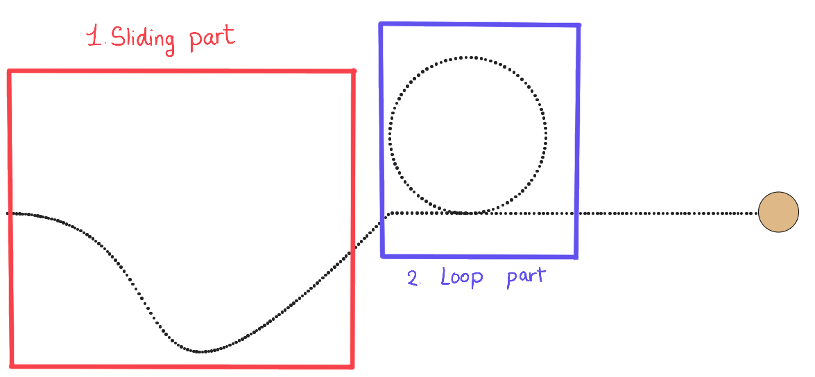
The Sliding Part
Creating the part the ball slides at can be done using the cubic-bezier function! The animation is made up of 2 animations, one along the x-axis and the other is along the y-axis. The x-axis animation is a normal linear animation along the x-axis. We can define its keyframes as follows:
@keyframes x {
  to {
    left: 500px;
  }
}
add it to your animation property in the ball path, as follows:
animation: x 4s linear forwards
The y-axis animation is the one where we will use the cubic-bezier function. Let’s first define the keyframes of the animation. We want the difference between the starting point and the ending point to be so small, that the ball reaches almost the same height.
@keyframes y {
  to {
    top: 299.5px;
  }
}
Now let’s think about the cubic-bezier function. We want our path to move slowly to the right first then when it slides, it should go faster.

- Moving slowly to the right means that P1 will be along the x-axis. So, we know it is at (V, 0)
- We need to choose a suitable V that makes our animation go slowly to the right but not too much so that it takes up the whole space. In this case I found that 0.55 fits best
- To achieve the sliding effect, we need to move P2 down the y-axis (negative value) so P2=(X, -Y)
- Y should be a big value. In this case, I chose Y=800
- To get X, we know that our animation speed should be faster when sliding and slower when going up again. So, the closer X is to zero, The steeper the animation will be at sliding. In this case, let X = 0.8
Now you have your cubic-bezier function, it will be cubic-bezier(0.55, 0, 0.2, -800).
Let’s add keyframes to our animations property:
animation: x 4s linear forwards,
    y 4s cubic-bezier(0.55, 0, 0.2, -800) forwards;
This is the first part of our animation, so the animation delay is zero. We should add an animation-delay property because starting from the next animation, the animations will start at a different time than the first animation.
animation-delay: 0s, 0s;
Note: If you’re unsure about the values of the cubic-bezier function, you can check out this website where you can visualize cubic-beziers and get an idea where P0 and P1 should be at.
Adding An Animation Along The X-Axis
Before making the loop, the ball should move along the x-axis for a short while so that there is space between both animations. So, let’s do that!
@keyframes x2 {
  to {
    left: 600px;
  }
}
- Add it to the animation property:
animation: x 4s linear forwards,
    y 4s cubic-bezier(0.55, 0, 0.2, -800) forwards, x2 0.5s linear forwards;
This animation should start after the sliding animation and the sliding animation takes four seconds, so the animation delay will be four seconds:
animation-delay: 0s, 0s, 4s;
The Result
See the Pen [rollercoaster part 1](https://codepen.io/smashingmag/pen/JjpEmLG) by Yosra Emad.
The Loop Part
To create a circle (loop) in CSS, we need to move the circle to the center of the loop and start the animation from there. We want the radius of the circle to be 100px so we will change the circle position to top: 200px (300 – desired radius). However, this needs to happen after the sliding animation is done so we will create another animation with a zero second duration and add the suitable animation delay.
@keyframes pointOfCircle {
  to {
    top: 200px;
  }
}
- Add this to the list of animations with duration = 0s
animation: x 4s linear forwards,
    y 4s cubic-bezier(0.55, 0, 0.2, -800) forwards, x2 0.5s linear forwards,
    pointOfCircle 0s linear forwards;
- Add the animation delay which will be 4.5s
animation-delay: 0s, 0s, 4s, 4.5s;
The loop itself
To create a loop animation:
- Create a keyframes that moves the ball back to the old position and then rotates the ball:
@keyframes loop {
  from {
    transform: rotate(0deg) translateY(100px) rotate(0deg);
  }
  to {
    transform: rotate(-360deg) translateY(100px) rotate(-360deg);
  }
}
- Add the loop keyframes to the animation property:
animation: x 4s linear forwards,
    y 4s cubic-bezier(0.55, 0, 0.2, -800) forwards, x2 0.5s linear forwards,
    pointOfCircle 0s linear forwards, loop 3s linear forwards;
- Add the animation delay, which will also be 4.5 seconds here:
animation-delay: 0s, 0s, 4s, 4.5s, 4.5s;

Moving The Ball Along The X-Axis (Again)
We’re almost done! We just need to move the ball after the animation along the x-axis so that the ball doesn’t stop exactly after the loop, the way it does in the picture above.
@keyframes x3 {
  to {
    left: 1000px;
  }
}
- Add the keyframes to the animation property:
animation: x 4s linear forwards,
    y 4s cubic-bezier(0.55, 0, 0.2, -800) forwards, x2 0.5s linear forwards,
    pointOfCircle 0s linear forwards, loop 3s linear forwards,
    x3 2s linear forwards;
- Adding the suitable delay, here it will be 7.5s:
animation-delay: 0s, 0s, 4s, 4.5s, 4.5s, 7.5s;
The Final Output
See the Pen [rollercoaster](https://codepen.io/smashingmag/pen/oNEBadz) by Yosra Emad.
Conclusion
In this article, we covered how to combine multiple keyframes to create a complex animation path. We also covered cubic-beziers and how to use them to create your own easing function. I would recommend going on and creating your own animation path to get your hands dirty with animations. If you need any help or want to give feedback, you’re more than welcome to send a message to any of the links here. Have a wonderful day/night!
(il)