


The Olympic poster reveal has long been an integral part of the buildup to the Olympic games. Host cities have been designing these works of art since Stockholm in 1912. Now, Paris has revealed their take on the tradition.
The most striking element of the posters is their diversity. Each artist was tasked with creating one poster for the Olympic Games and another for the Paralympic Games. The IOC employed a jury of athletes, artists and officials to handpick the winners.
The winning seven comprises five French artists and — incidentally — two Americans. While the artists were discouraged from making any political references (naturally), they were given free rein to push the limits with their designs, and it shows.
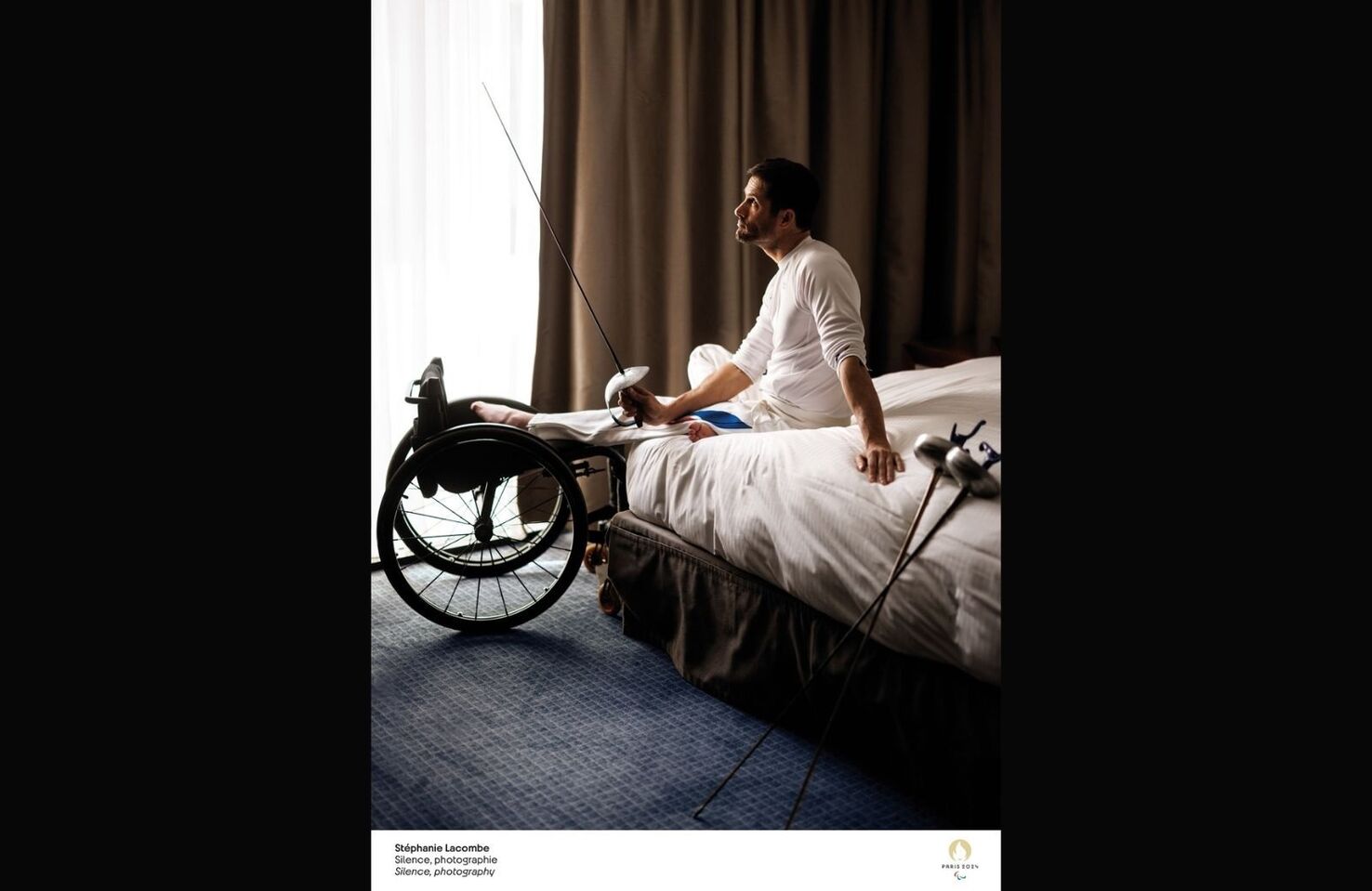
Stephanie Lacombe, for example, opted for a photorealistic design, depicting a paralympian examining his sabre set on a neutral background. The poster is incredibly poignant, depicting the calm before the storm for individuals competing in what will likely be the biggest moment of their lives.
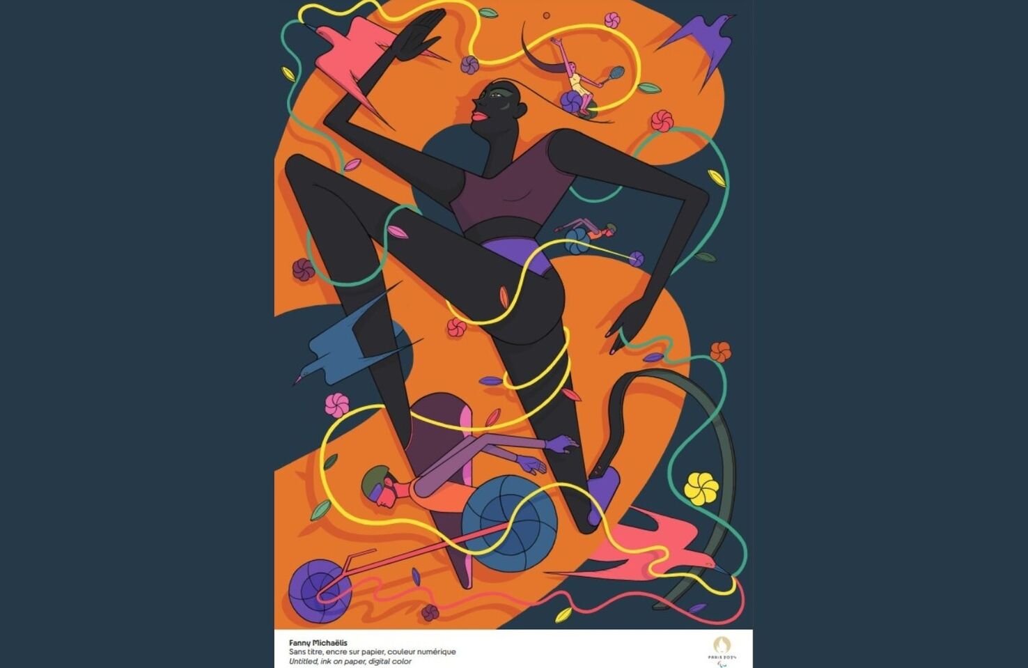
In contrast, Fanny Michaëlis designed a captivating, curvaceous poster laced with vibrant icons and Olympic colors.
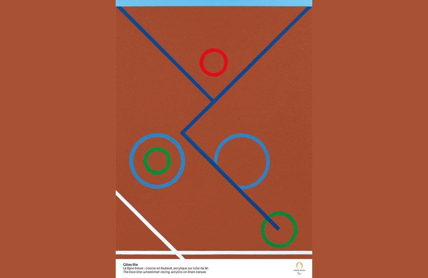
Giles Elie’s posters are entirely abstract, rejigging the Olympic color patterns to create unusual designs that are at once simplistic and incredibly creative. His paralympic poster, for example, depicts Wheelchair racing, with the blue lines representing the body, the red circle the head, and the remaining shapes the wheels.
Along with the debut of the posters, the IOC launched the Cultural Olympiad website, allowing the public to find programming details. Upcoming activities this year include:
Max Walton
Born in Cardiff Wales, Max relocated to Brisbane when he was 12. He’s spent the last five years developing expertise in the Fintech industry. When he’s not posting about Web3, you’ll find him on a paddleboard.