


Here’s what’s trending in design this month.
1. Round, Animated Text Elements
Everywhere you look, there seem to be spinning circles of text. While these elements aren’t the easiest to read, they are intriguing to the user.
What are you supposed to do with this spinning content? Click? Just look at it?
Usage can vary greatly by the design, but one thing is certain. It gets your attention, and designers seem to love this technique right now.
In almost all uses of round text elements, there’s a circular motion that accompanies the text. For the most part, the motion spins clockwise – this follows natural readability – although that’s not always the case. Another commonality is that these elements often contain only a few words, further aiding readability.
Here are three examples doing it in similar but different ways.
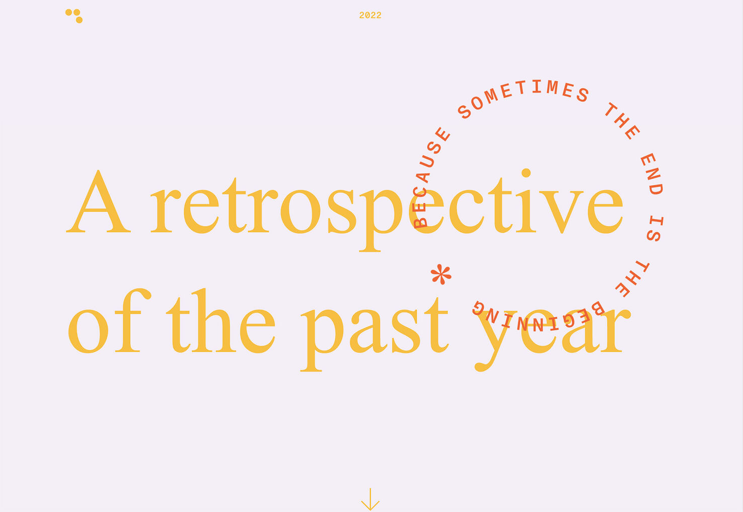
Thirteen23 uses a large spinning text element over the main headline to draw attention. The motion actually shifts between clockwise and counter-clockwise with a mouse hover.
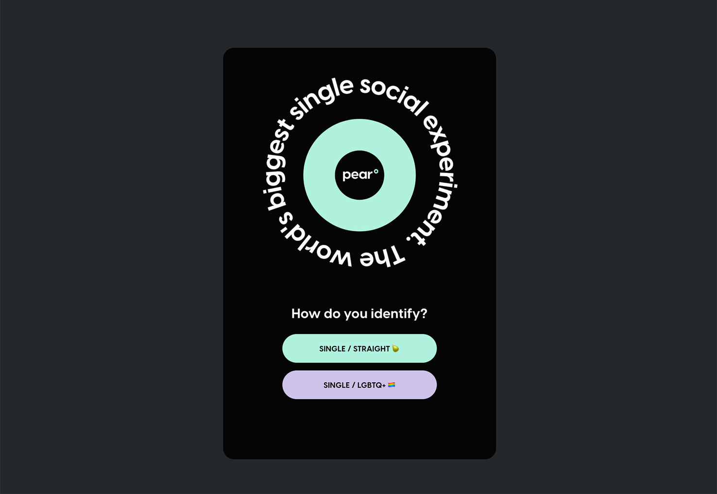
Pear uses a quick motion ring of text next to branding to help draw the user in so that they focus on the quick call to action to get started with the app below. This is one of the larger text size uses we’ve seen in this style, and the motion is pretty quick.
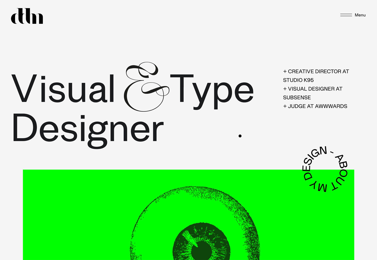
Danilo DeMarco uses simple, round, animated text elements for a portfolio website. The element is designed to help draw your attention toward the scroll and deeper into the portfolio website.
2. Collage-Style Image Treatments
When you don’t have a large image or video for the homepage, a bunch of smaller images can do the trick. Many of the collage-style treatments we’ve seen include quite a few smaller photos, often with an interactive component, and in a variety of shapes and sizes.
This is one of those design trends that seems to break all the rules to have a life of its own. In most cases, this visual chaos still seems to work, although it defies logic to a certain degree.
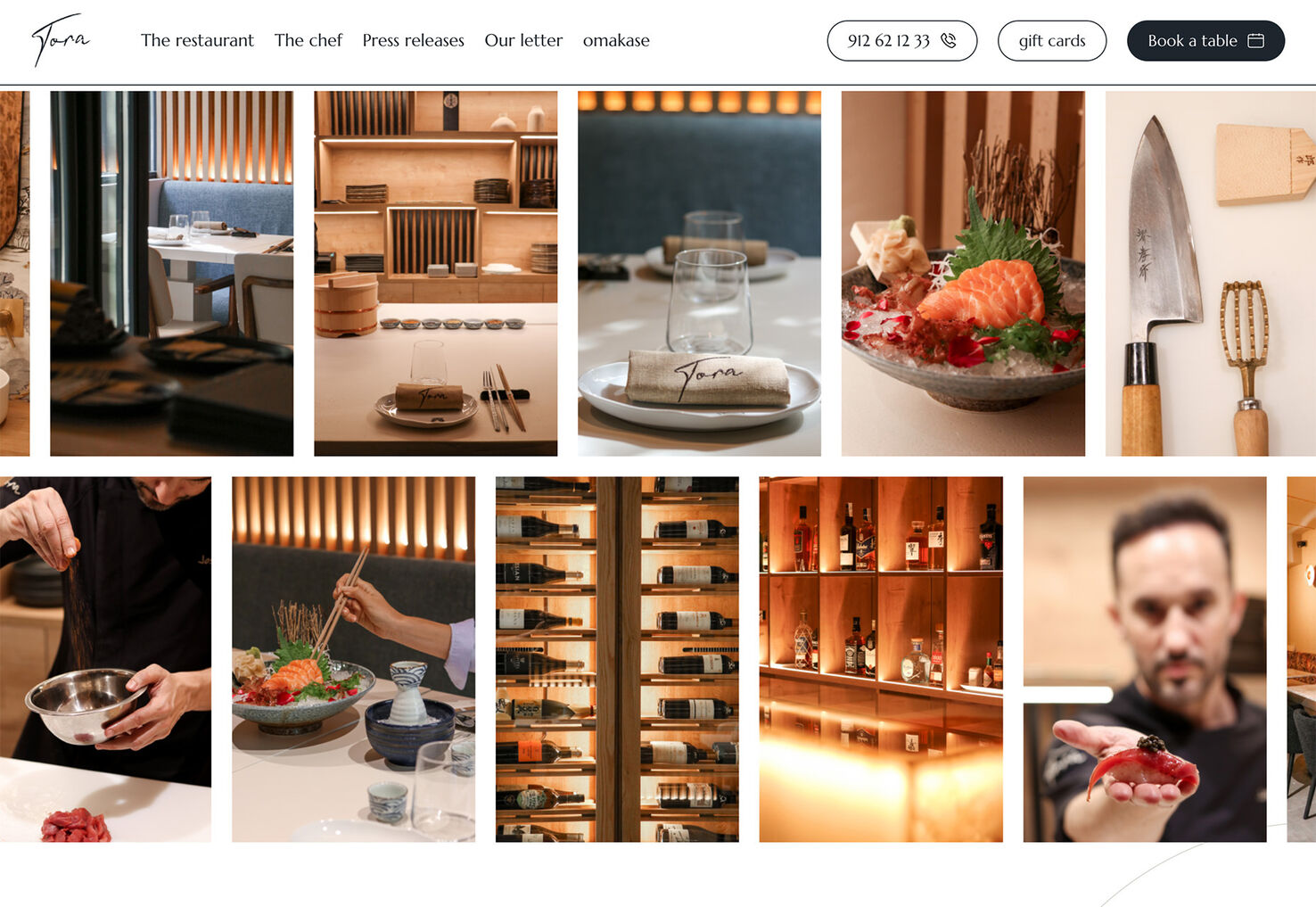
Tora does it with two rows of images that scroll slowly in opposite directions so you get a feel for the restaurant. This collage uses a tight and organized grid with a very planned feel.
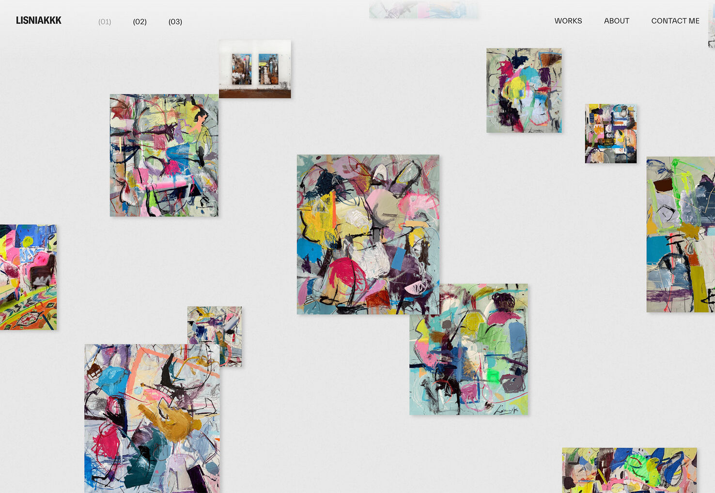
Lisniakkk has small photos of paintings placed in a seemingly haphazard fashion on the homepage that animate with a zoom-in effect on hover. Additionally, each piece of art is clickable. What’s most interesting here is that elements in the “collage” overlap. This isn’t very common among other designs in this style.
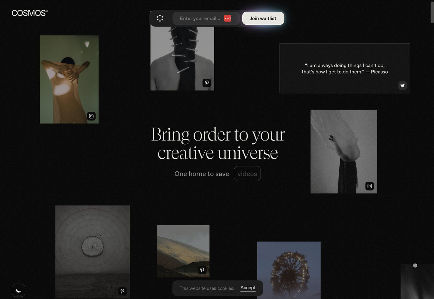
Cosmos uses multiple images in different sizes, shapes, and on different grids to create an interactive showpiece. There are interactions that happen on hover and scroll that take you deeper into the images.
3. Huge Text Treatments
How big is too big for text elements? Each of these website designs pushes that boundary. How does it make you feel? Is the text size uncomfortable or fresh and different?
The commonality is that each of these designs uses a single, huge word as the primary art element as well as branding. Each example also uses the “big word” in a different way to draw in users uniquely.
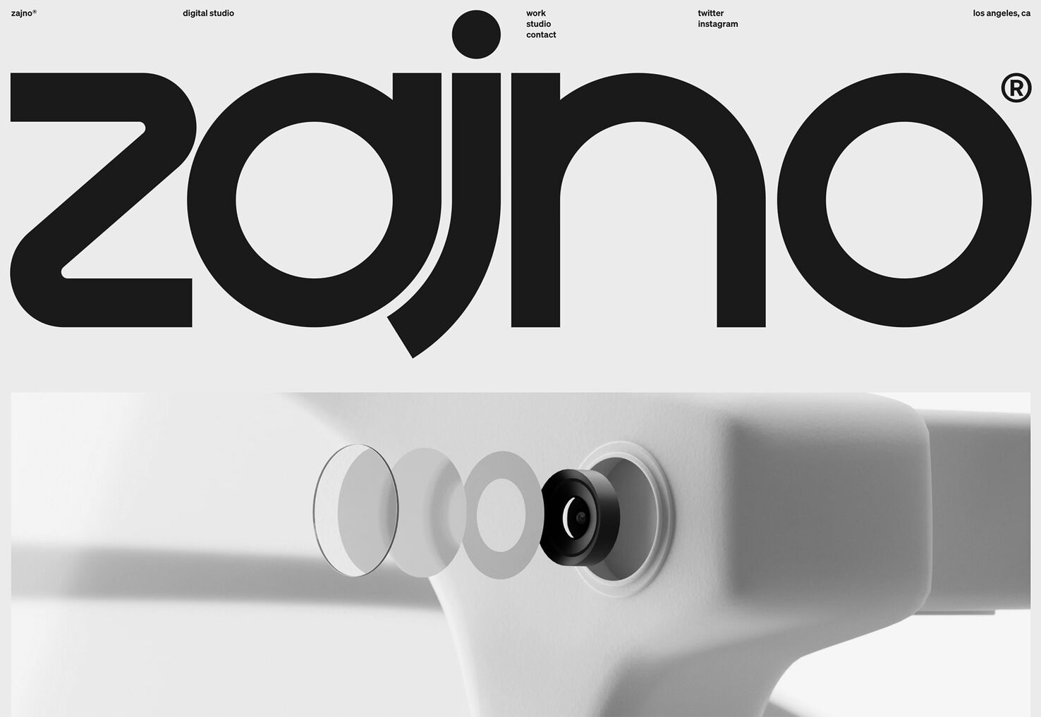
Zajno leads with a larger-than-life brand name. The navigation elements are tiny and are in the same space as the oversized headline. The type treatment is tight and compact even though letterforms have a lot of heft. While it looks cool, do you know what the site is about?
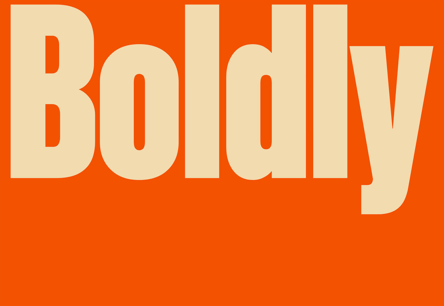
Boldly Foods uses giant lettering on a bright background as a load screen while the rest of the design comes in. (It then features big images in a slider, with a stall large “Boldly” brand element.)
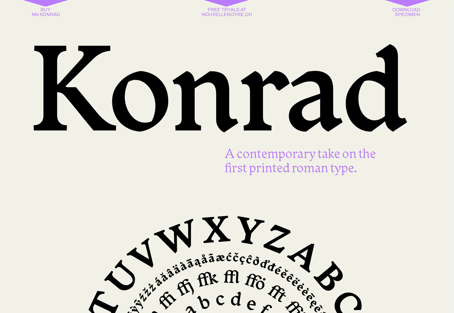
Konrad uses a big, beautiful font to showcase the letters from the type house. This might be one of the best uses of this technique we’ve seen because the huge text element is to help showcase and sell that exact typeface. (Keen eyes will also note the use of the type specimen in the round animated circle at the bottom of the homepage screen as well for two trends in one here.)
Conclusion
While not all website design trends are created equal, some are more usable than others. Each of these trends is fairly simple to deploy and can help provide something visual for a design when you don’t have a lot of great art to work with. Hopefully, these examples provide inspiration for just those types of projects.