

")
")

Whether your style is bold, soft, or somewhere in between, we’ve got something perfect for you. So let’s take a look at some of this month’s must-see website designs to get some fresh ideas for your upcoming projects.
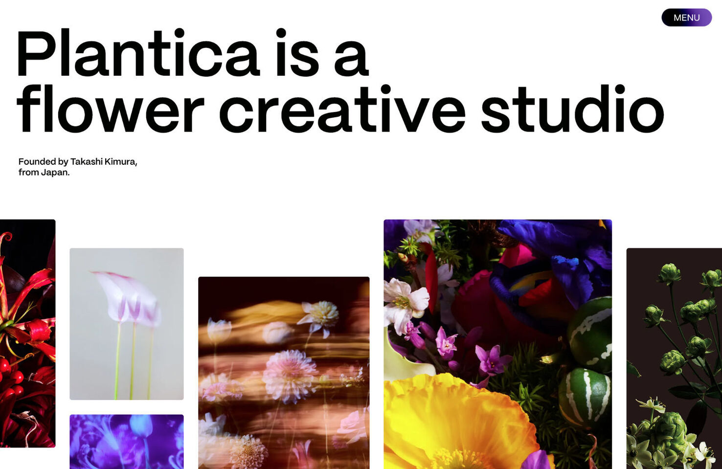
This site for floral design studio Plantica keeps its navigation and content simple and concentrates on the visuals. The result is beautiful and a pleasure to explore.
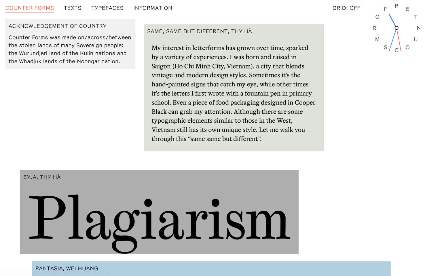
Counter forms promote emerging antipodean type designers. Featuring a handful of typefaces as well as articles on type, there are no images per se. Visual interest is created using element backgrounds, creating a collage-style look. The grid on/off toggle on the home page is a nice detail.
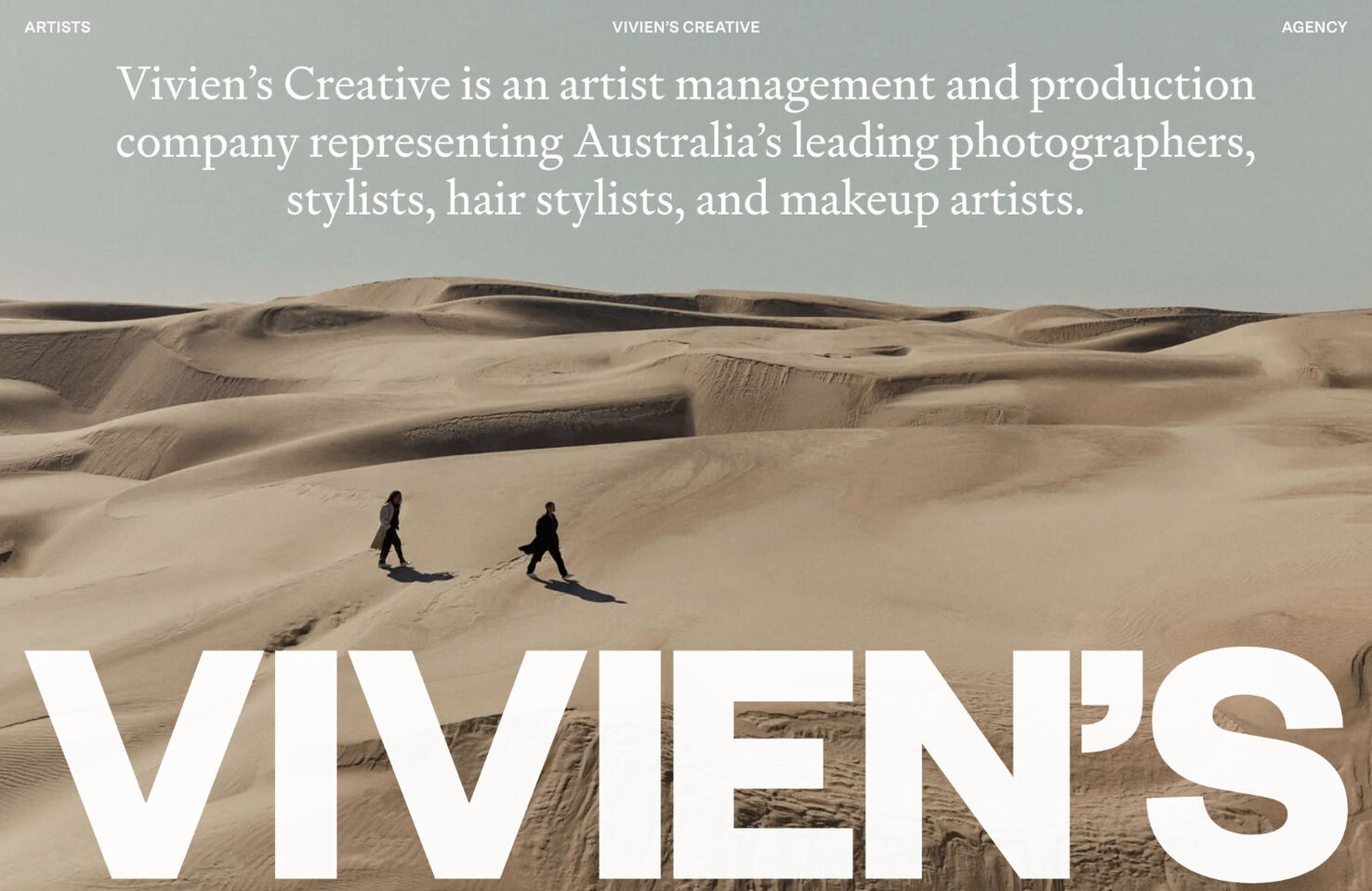
While Vivien’s Creative follows what has become a fairly standard template for creative management agencies these days, the image curation is top-notch here. Although the work shown is by different artists, they work together well to create a homogeneous whole.
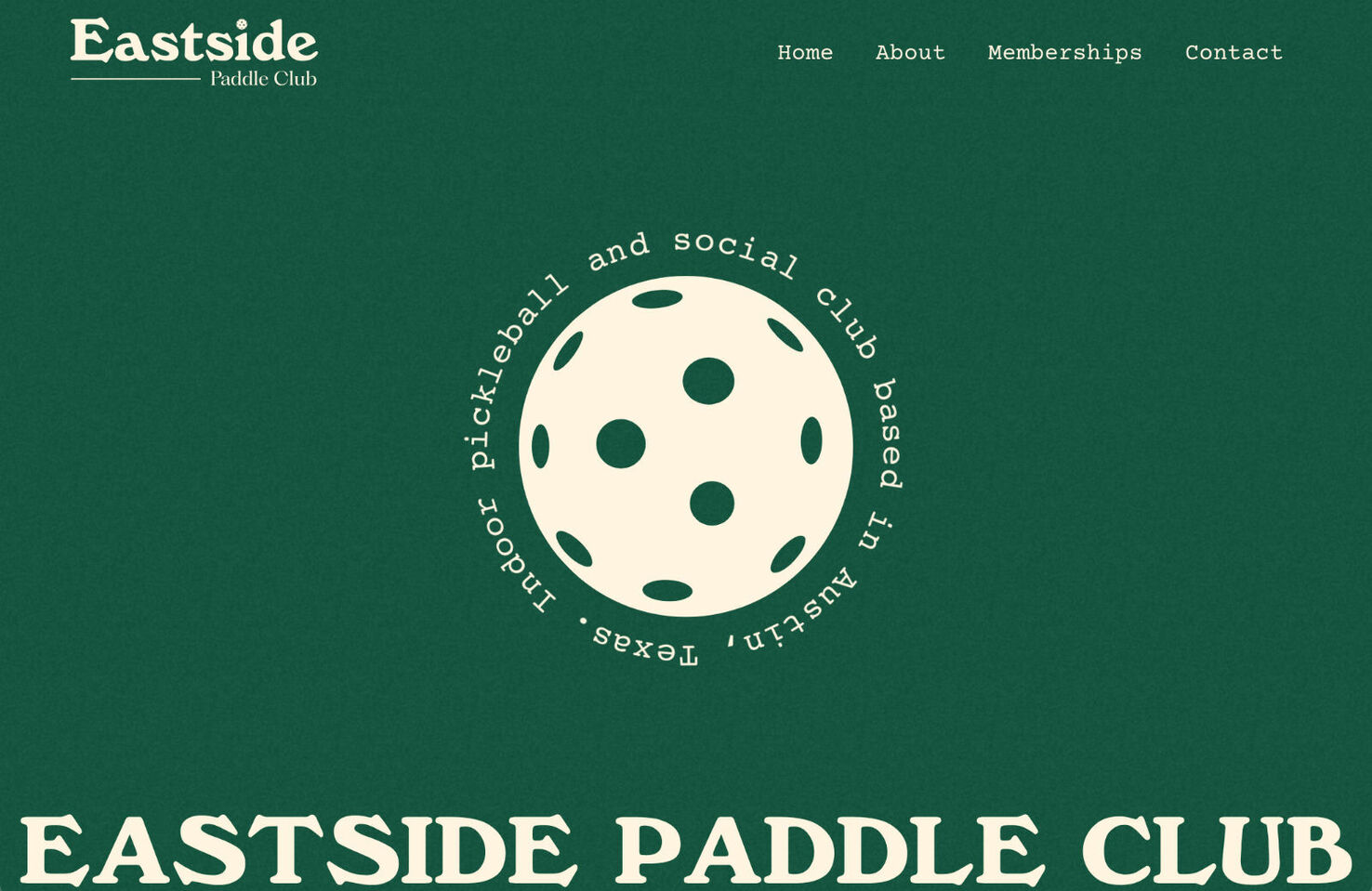
East Side Paddle Club — a private pickleball club opening in Fall 2023 — goes for a fun, vintage look in this simple, one-page site. The content is spare but doesn’t feel lacking, and the result is friendly and inviting.
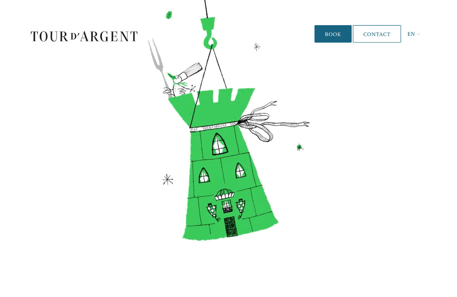
Parisian restaurant Tour d’Argent is famous for its duck. Instead of the usual glossy photographs of food, it uses vintage mid-20th-century style illustrations featuring anthropomorphic ducks to add visual appeal.
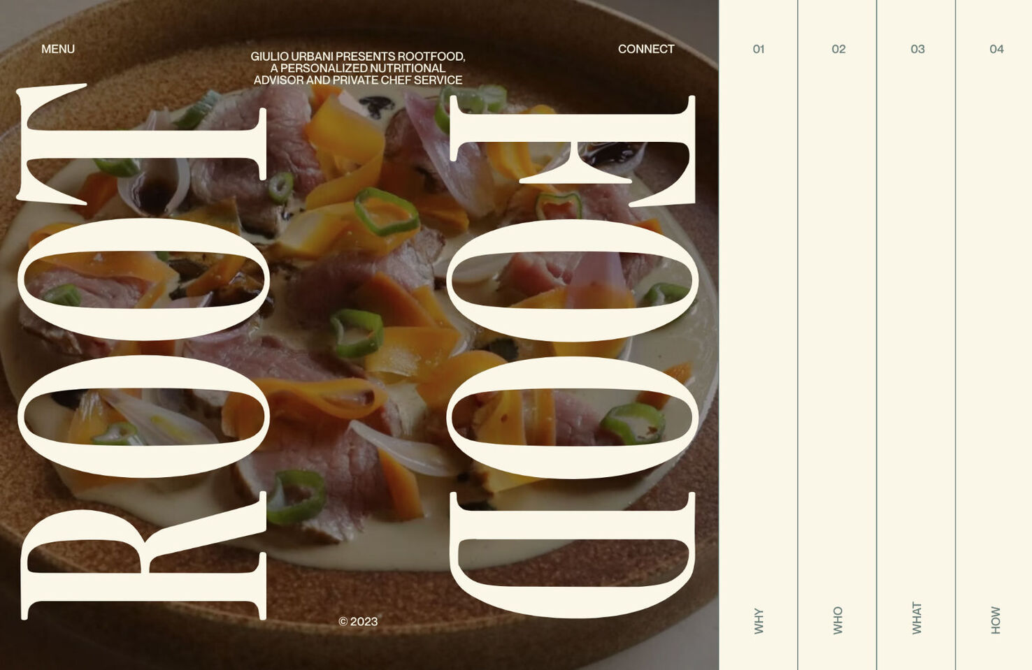
Rootfood is a personalized nutritional advisor and private chef service. Built using Nuxt, the sideways scrolling on desktop combined with the well-positioned photographs create a pleasing experience. It is even simpler on mobile, and the different text colors come more to life.
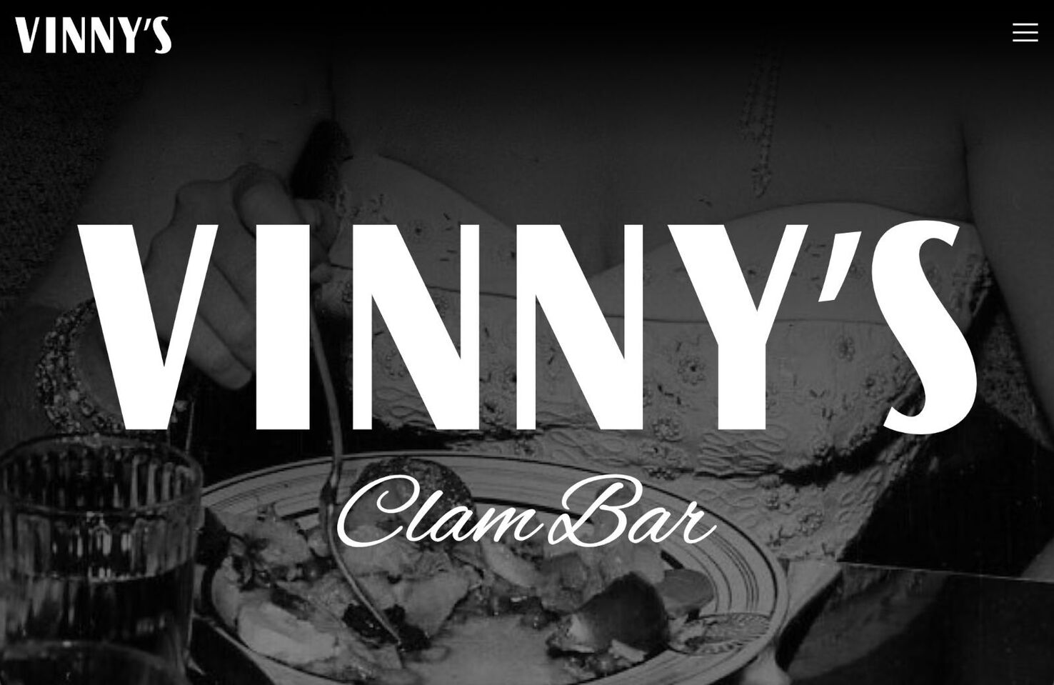
This site for Vinny’s Clam Bar goes for a style that evokes an Italian eatery more Martin Scorsese than Villa Borghese. It’s bold with a retro twist.
There are so many great designer and developer portfolio sites out there it can be hard to come up with something that conveys professionalism and personality at once. Pierre Mouchan has achieved that with his illustrated introduction.
Atlas Card is a payment and rewards card that offers some pretty nice perks aimed at a wealthy clientele. To reflect this, the website keeps things minimal, with soft edges, clean type, and light colors.

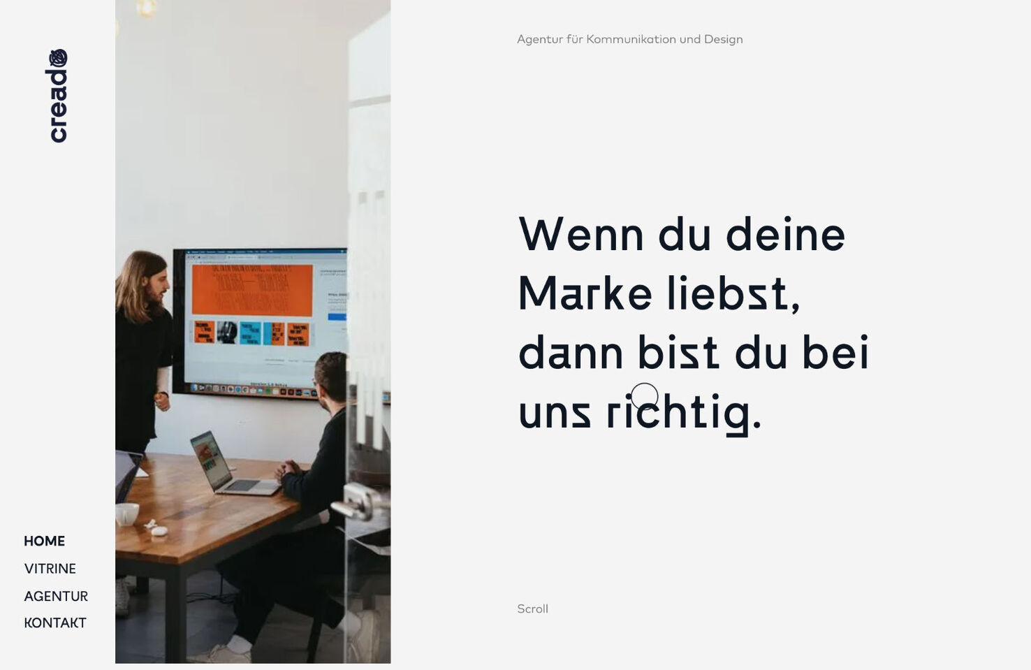
This site for Creado design agency has a light and airy feeling to it. Work is presented well, and even a non-German speaker can have no problem getting around the site.
Agropole is a technology park focused on the agri-food industry. Bright, juicy colors and animation details make it feel fresh, airy, and positive.

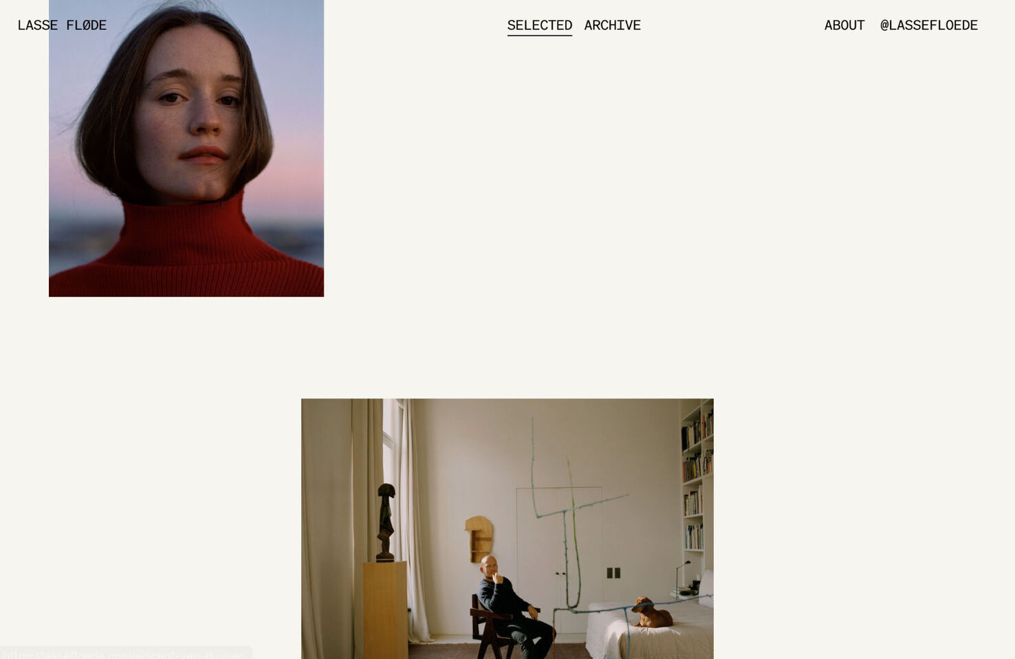
Photographer Lasse Fløde’s site switches between a more spaced-out, irregular layout for selected showcase images and a tighter, regular grid for archive work. It’s an effective way of showing a lot of work without overloading the viewer.
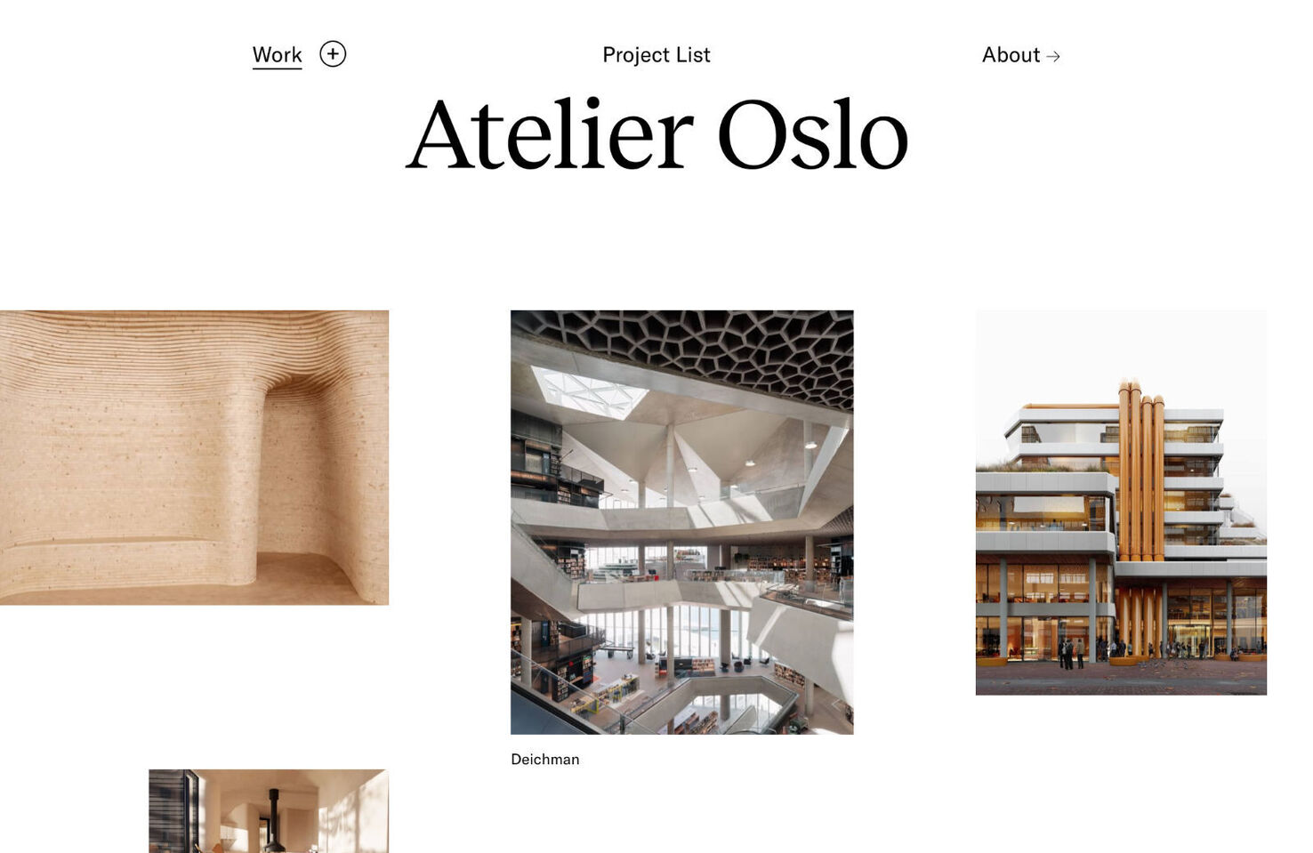
Atelier Oslo’s site is another excellent example of an irregular grid. The varying image sizes mean the eye doesn’t get bored, and each image maintains its impact.
On the one hand, this site for Homegrown Garden Centre may not immediately strike the user as being for a garden center, and so could be considered a failure. On the other hand, most garden center websites do little to entice visitors to the physical place. This one does.

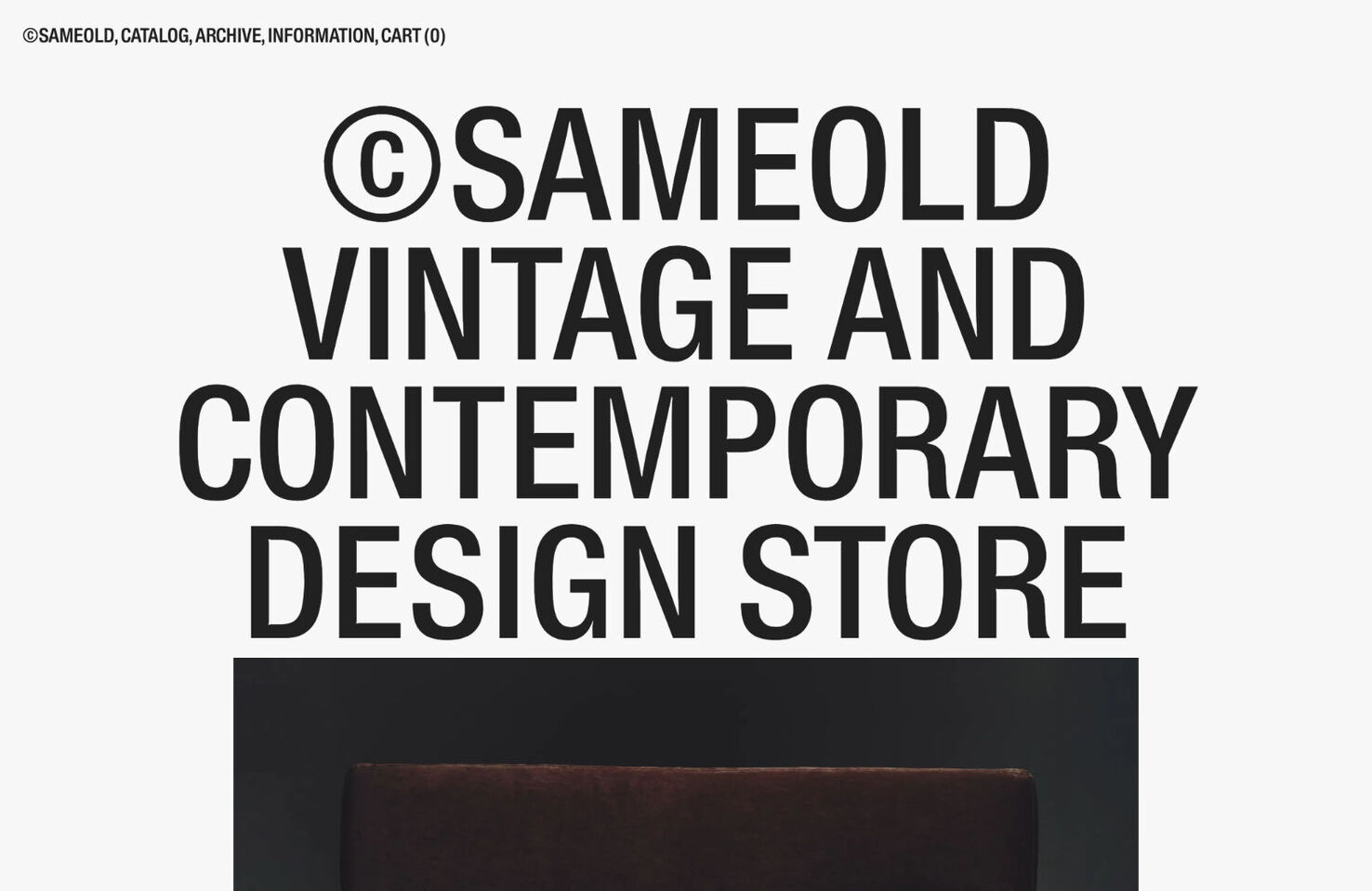
Same Old sells a mixture of vintage and contemporary design pieces. The giant type and on-scroll image resizing give it a fresh, modern feel.
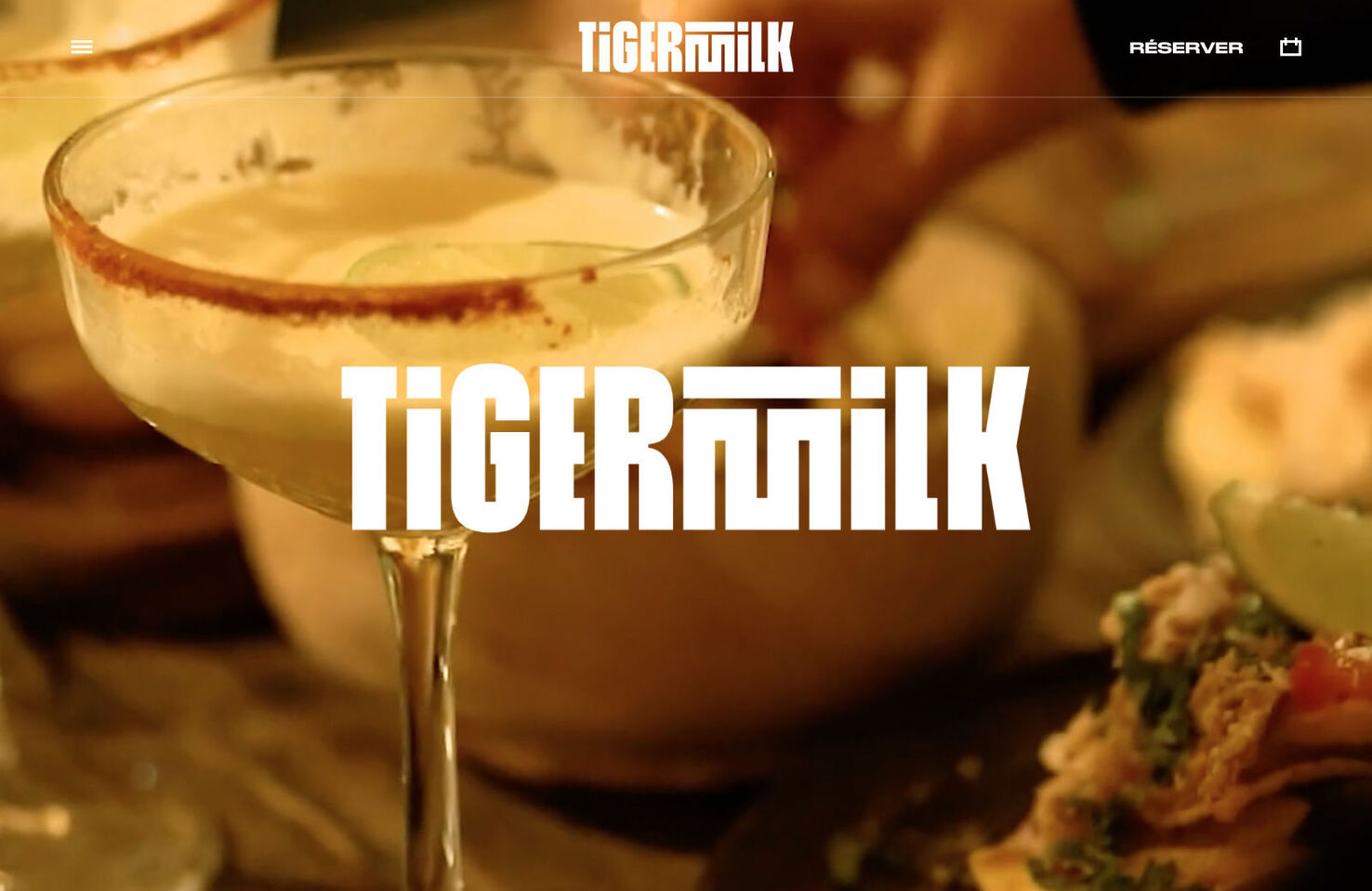
Tigermilk’s site goes for a more-is-more approach. There is giant type, illustration, layered images, on-scroll animation, video, and bright color. It all works together to create a fun, vibrant atmosphere.
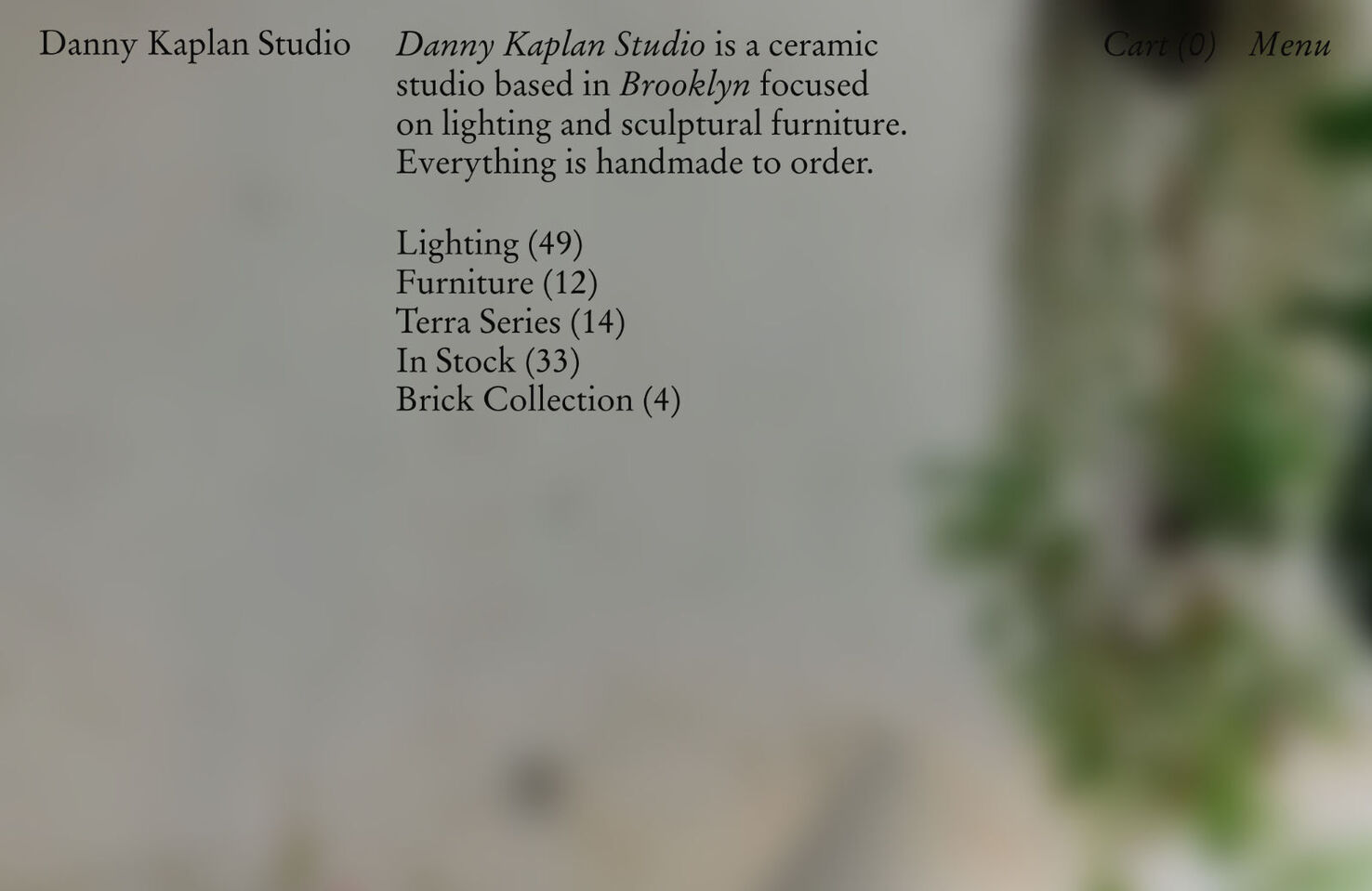
This site for Danny Kaplan Studio intersperses still photographs with video to effectively emphasize the handmade nature of the ceramics for sale.
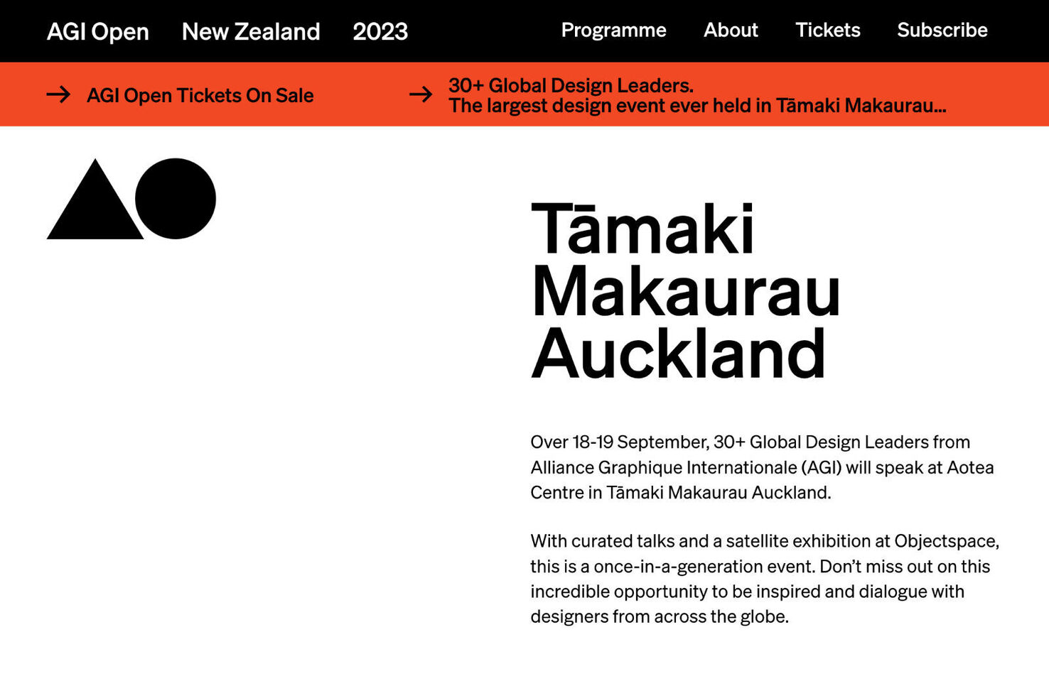
This year’s AGI Open is in Auckland, Aotearoa. You would hope that a website for a conference featuring 30 of the world’s top designers would be pretty good, and this one is. It’s simple and easy to get around.
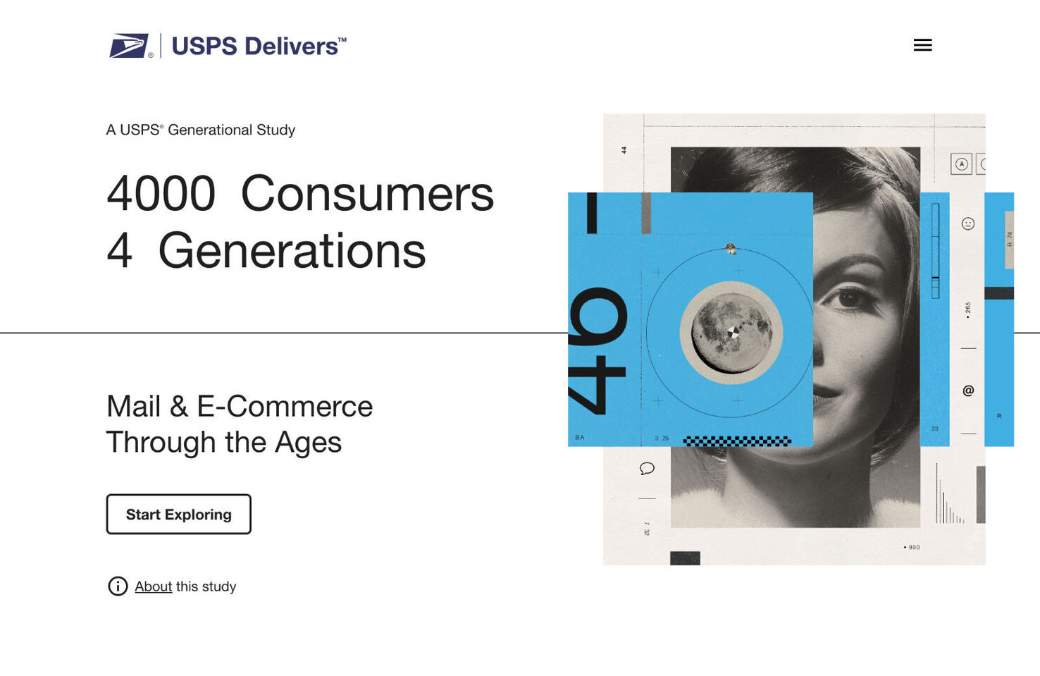
This is a marketing survey report on differing generations’ attitudes to receiving mail. It uses color and a clean layout to present the information clearly and in a way that maintains interest.
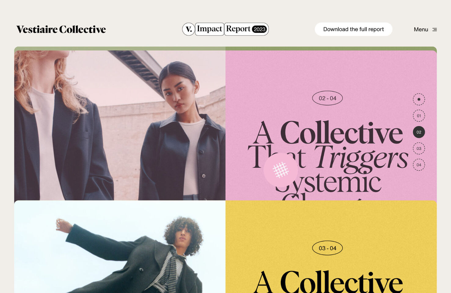
This report is about the impact of a more circular and more sustainable fashion industry. The positive colors, large, confident type, and overall modern feel reinforce that it is demonstrating the benefits of change.